

%20(1)%20(1)%20(1).png)
Fireside Solutions focuses on helping companies establish a scalable digital presence and adopt the latest technologies. Fireside Solutions is passionate about contributing to the growth of businesses that emphasize service by assisting them in using technology to provide more value to the communities they serve. Fireside brings the industry's latest insights to their partners and will need a new site to reflect that.
The objective of this project was design an interactive experience that will appeal to potential client objectives, reflect their company culture and goals.
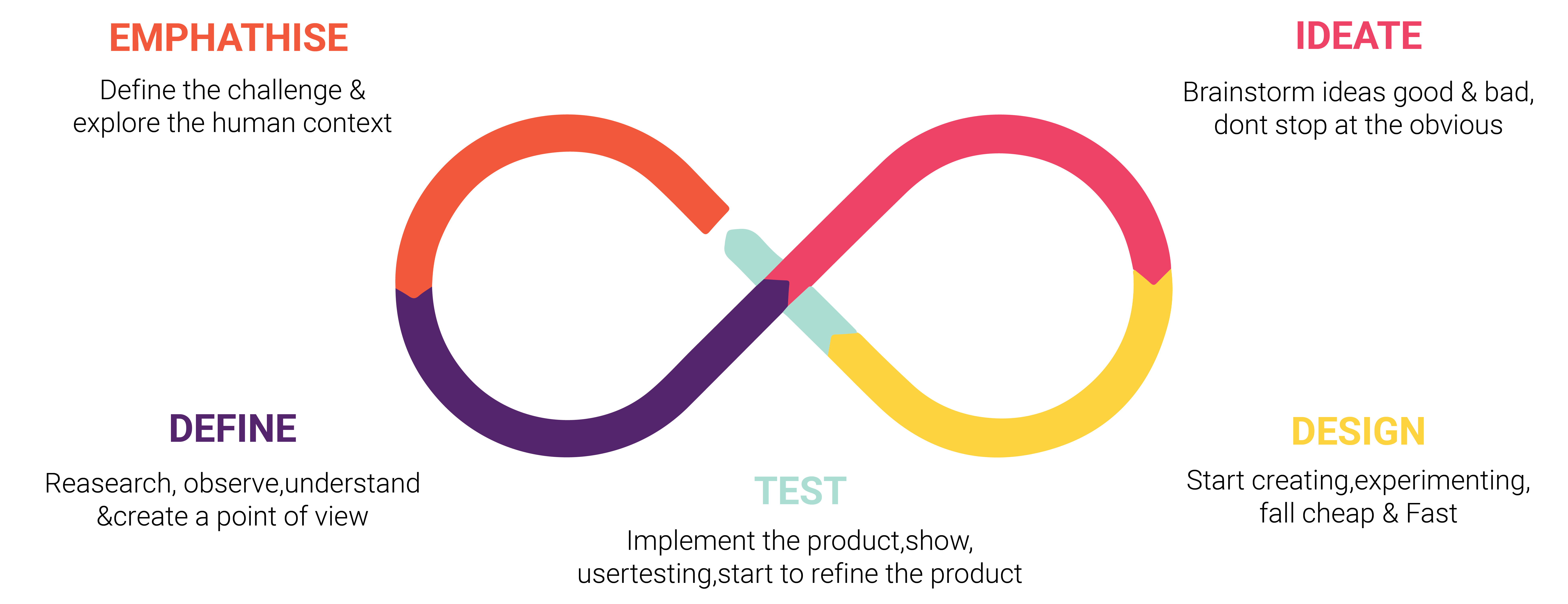
I follow a simple Design Thinking Process which emphasizes on understanding user needs, evaluating them, mapping design solutions, validating the designs by conducting usability tests and integrating the feedback. Key learning points from each phase were used in the next phase to make better design decisions. The design and testing phases are in a loop to justify the user centric design process.
Design Goals
First, I wanted to make sure I had a clear understanding of Fireside's business goals and plans for the future. It's important to internalize the company's objectives when designing to represent the brand's message, generate the right leads, and give potential clients in-depth knowledge about who Fireside is and what they offer.
Identify Users
We outlined their user audience's identity and wanted to ensure that the landing page is designed to meet their needs. We first wanted to establish a clear user pathway that satisfies different users' goals by thinking through scenarios that focus on the new user, recurring user, and potential investor.


Define User Needs
The users will need an interactive landing page that will attract a youthful audience and outline the company's full list of services that will target potential users through interactions through careful sizing and the positioning of interface elements.
Main Objectives
- Improve visual brand
- Make landing mobile a priority
- Clear message to clients
- CTA
Information Architecture
I collected all of the site information and decided on the content's arrangement so each potential user can adjust to the landing page's functionality and find everything they need without a significant effort.

Ideation
I want to keep the users engaged by implementing a continuous scroll landing page with interactive capabilities. This flow presents new content as the users scroll down, so all content is introduced.
Pros:
-Keep users on the site longer
-Users make a conscious decision to consume more information
-Less likely to click away
-Quick Introduction like experience
Cons:
- A large about of information would not benefit from a continuous scroll
- Might encourage users to skim and skip ahead
- Distracting to user
- Users looking for specific information would nog benefit from scrolling


Ideation Feedback
Based on the researched recommendations and presented the concept's pros/cons, the client decided on a continuous scroll option. The content will be in small amounts, so the design infrastructure is not threatened.
However, as the company grows and more information is added, they will update the site to a more suitable design intended for that goal.
Color Palette
The color palette symbolizes youth, fire/warmth, enthusiasm, creativity, encouragement, renewal, and intellectual. Hence, a warm fire color palette fits a company that promotes exciting energy and youth in technology. Additionally, I used white for the text and included slate to give a neutral and clean appearance.

Style Tile
Creating the style tile illustrates the interface elements for the preferences and goals of the site design:

Custom Patterns
I created different patterns to add contrast with texture to keep space balanced and add visual interest.

Interaction
Following the information architecture, I learned the company services would be the main point of interest for most users. Therefore, all services would need to be presented first in the user flow. The goal was to create an interactive experience between the user and the product.
Achieving a simple interaction with defined goals will achieve pure delight with the user.
I mapped the service interaction illustrated below then created the actual interaction in Adobe After Effects.
.gif)
.gif)
.gif)
High Fidelity Wireframe
The critical part was to have the user get through each section without getting discouraged and leave the site. We wanted to keep each section clear and concise. To ensure all interactions would perform regardless of screen size, I developed the mobile wireframe to ensure each section was responsive.

Feedback
For the wireframe evaluation, we created scenarios for potential users to reveal possible design issues. During the walk-through we uncovered visibly, and possible crowding issues that could overwhelm the user.
I corrected the crowding issue by reevaluating the spacing and then conducting a Coblis test to correct any visibility discrepancies.
Final Design


Cognitive Walkthrough
To evaluate the user flow of the site post immediate changes I constructed a cognitive walk through with potential users to correct any usability issues that will prevent site from being fully functional.
During each step, corrections were made based on answers to all the following questions, together with explanations supporting the answers:
Is this what you expected to see?
Are you making progress towards your goal?
What would your next action be?
What do you expect to see next?
Conclusion
I learned so much from this project. Mainly decreasing the cognitive load can significantly impact the user experience and keep interaction with digital interfaces engaging and straightforward.
Adapting to UX trends can be tricky, so understanding how to implement them into new projects can over-complicate the experience or, in this case, bring the project to a new level.